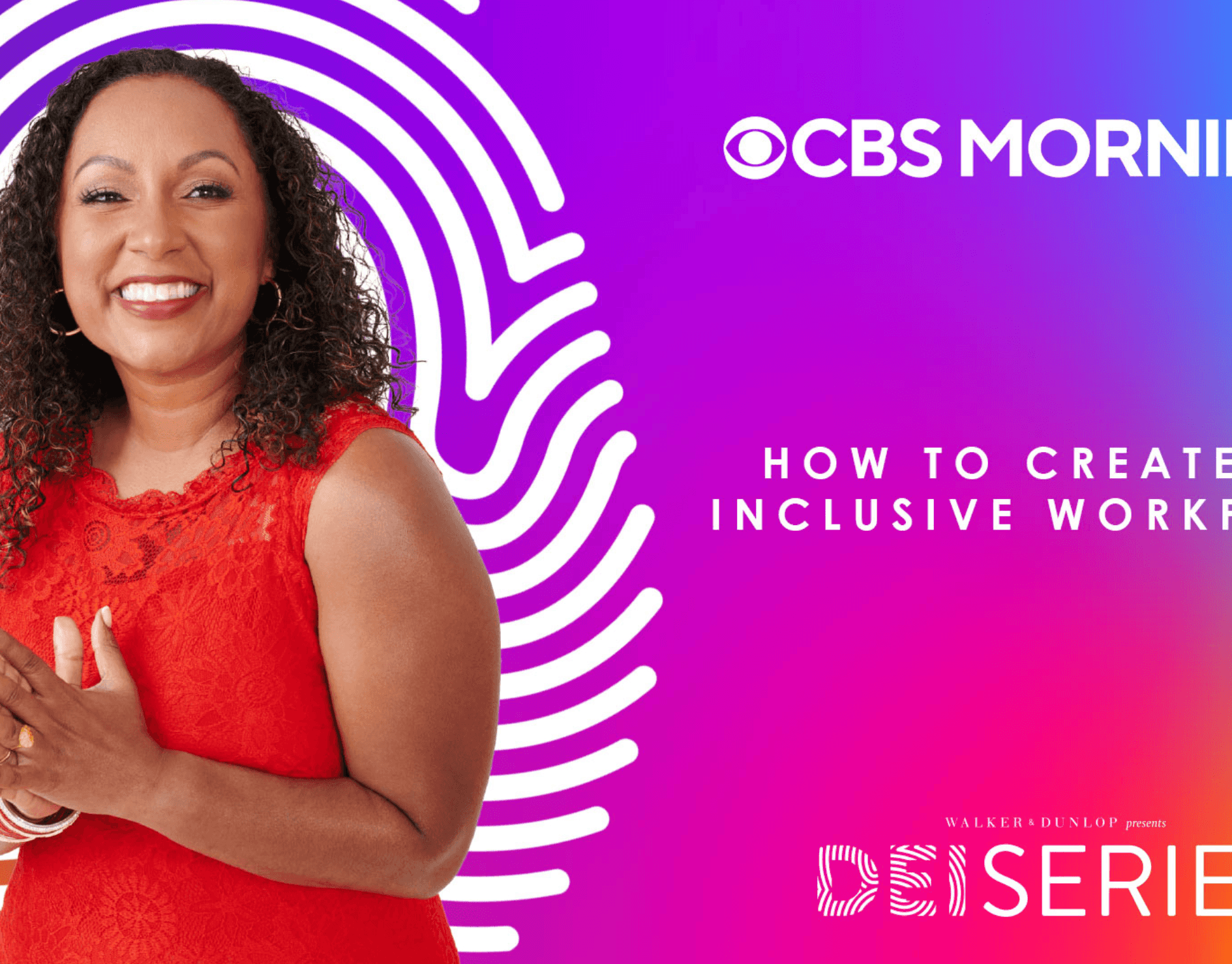
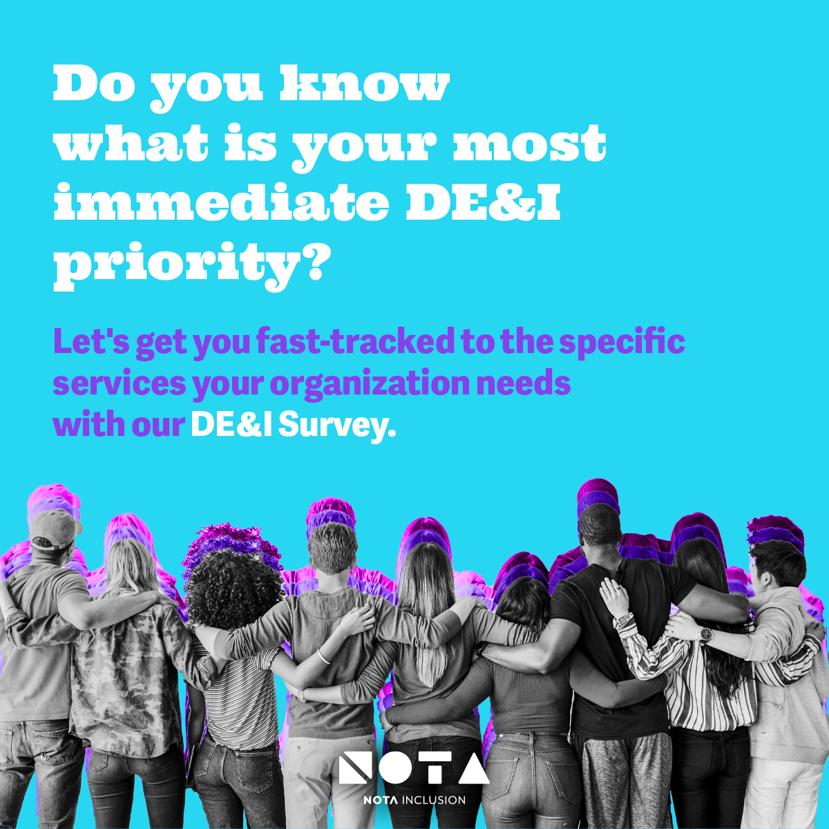
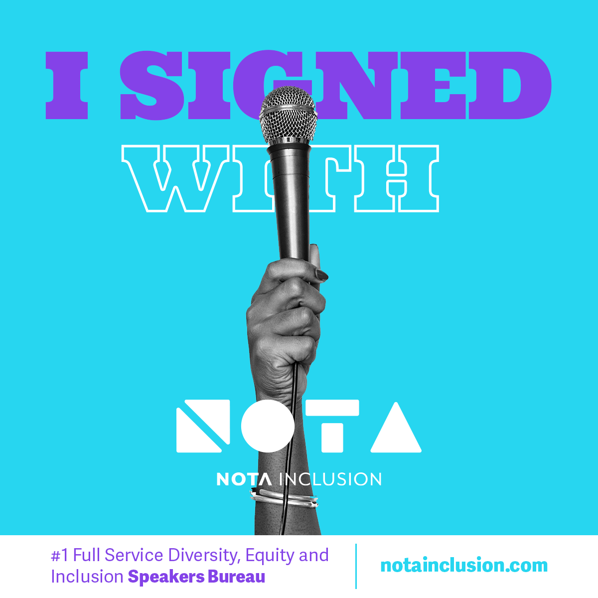
When NOTA was born as a new kind of DEI-focused consultancy and speakers bureau, the challenge was clear: how do you visually express a brand built on voices, stories and the power of collective change?
As Art Director, I led the creation of a bold visual system designed to capture the emotional energy behind inclusion—bright colors, unapologetic typography, layered imagery, and a graphic language that feels alive, human and unfiltered.

The campaign revolved around a single truth:
communities move forward when the right voices are heard.
communities move forward when the right voices are heard.
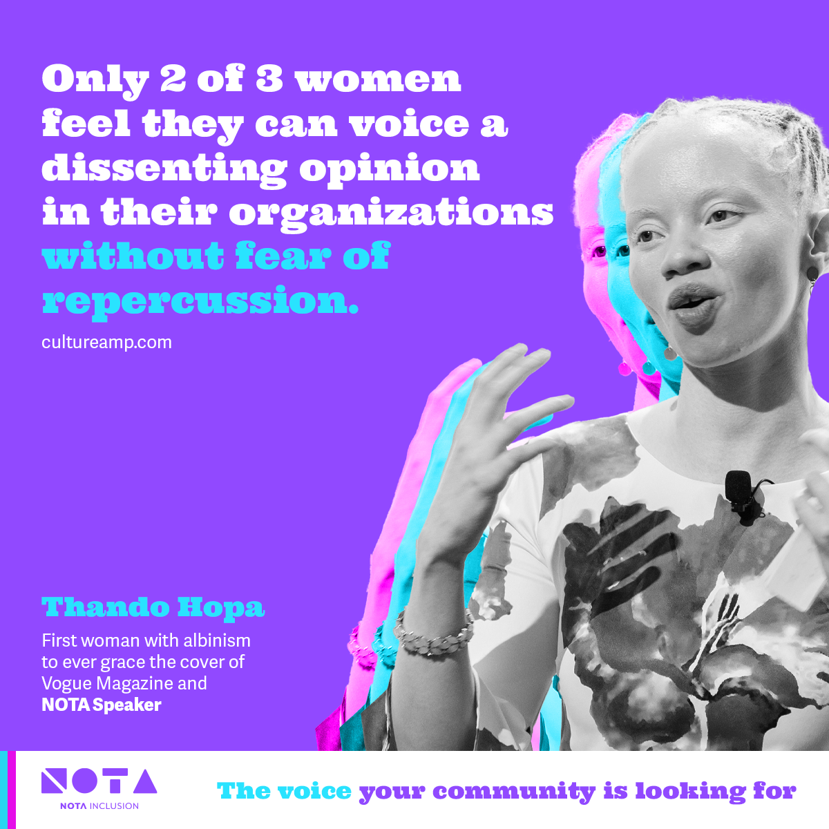
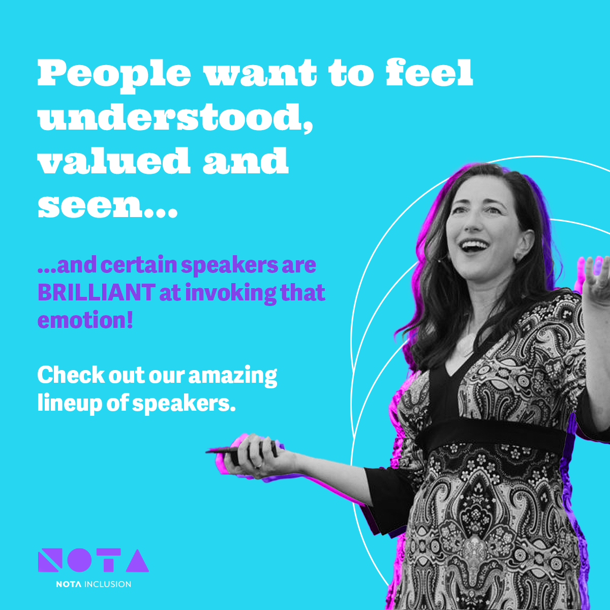
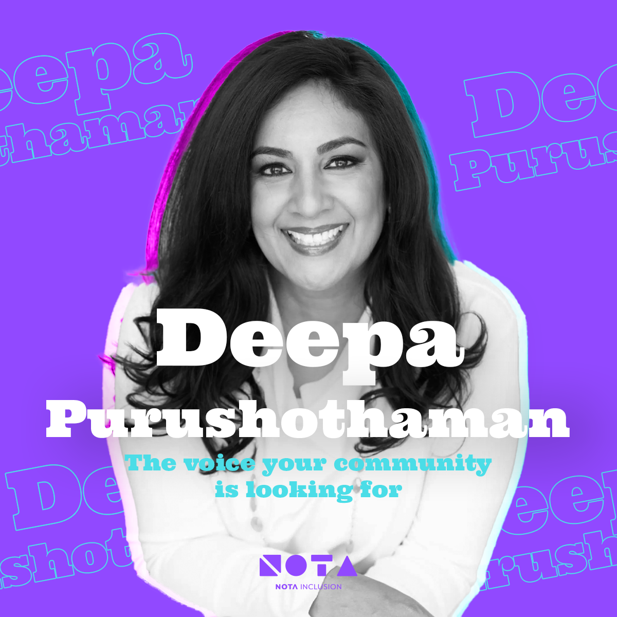
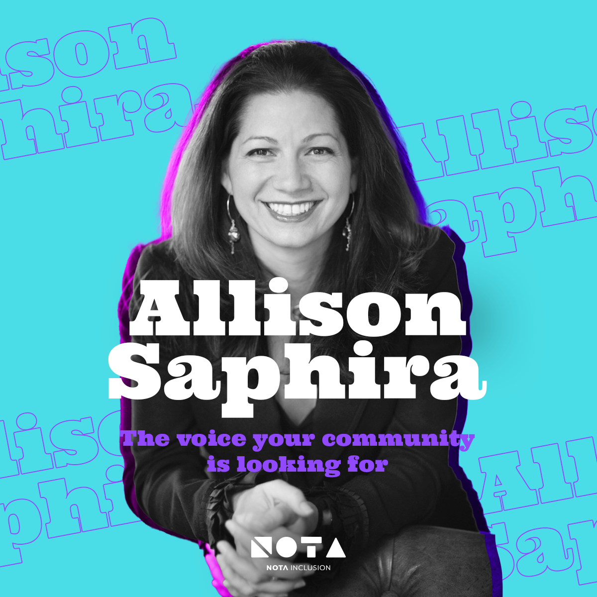
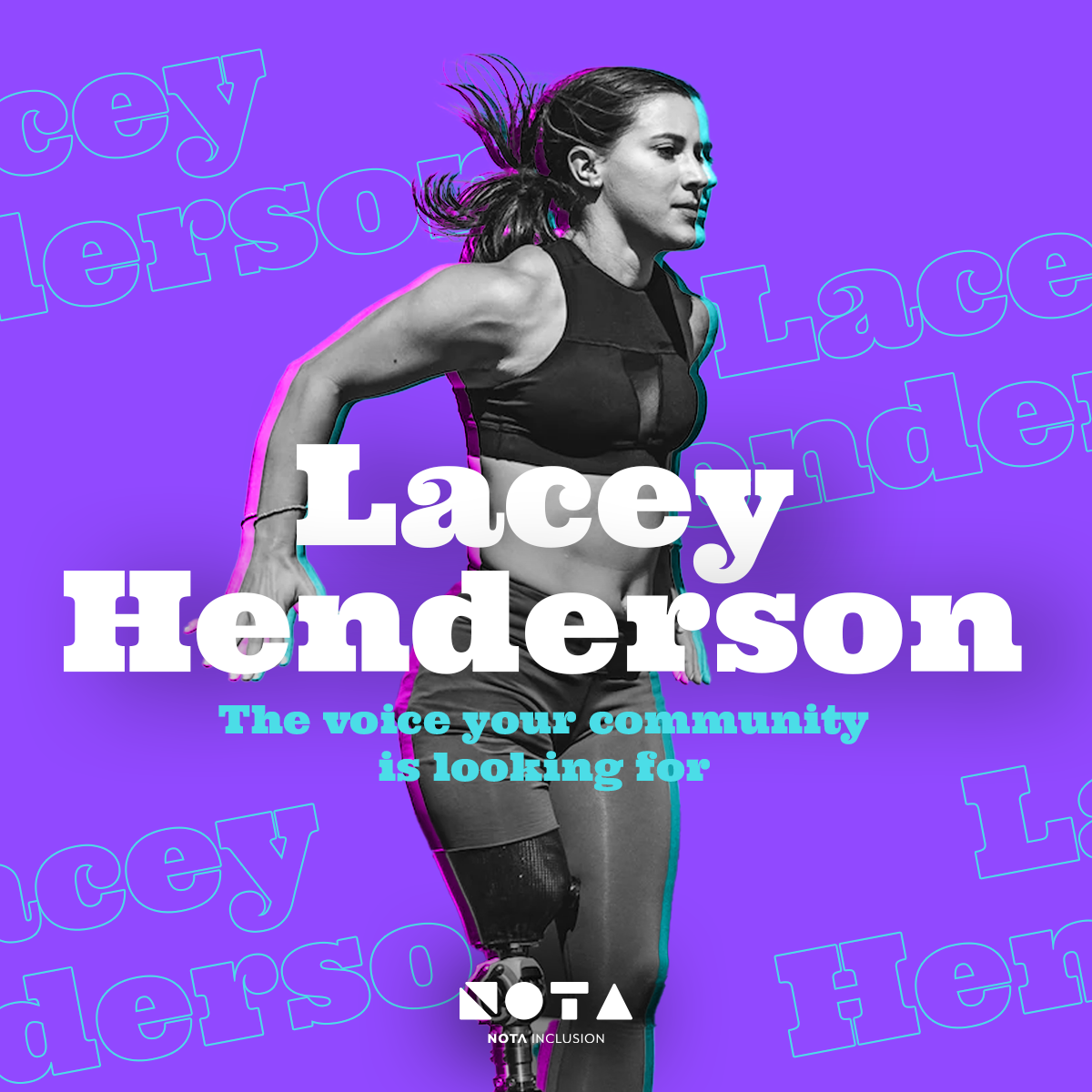
From speaker spotlights and digital ads to storytelling banners and social activations, every asset was crafted to magnify that idea. Featuring leaders such as Thando Hopa, Deepa Purushothaman, Lacey Henderson, and others, the visual concept blended high-contrast photography with vibrant overlays to symbolize diversity, dynamism and the urgency of visibility.
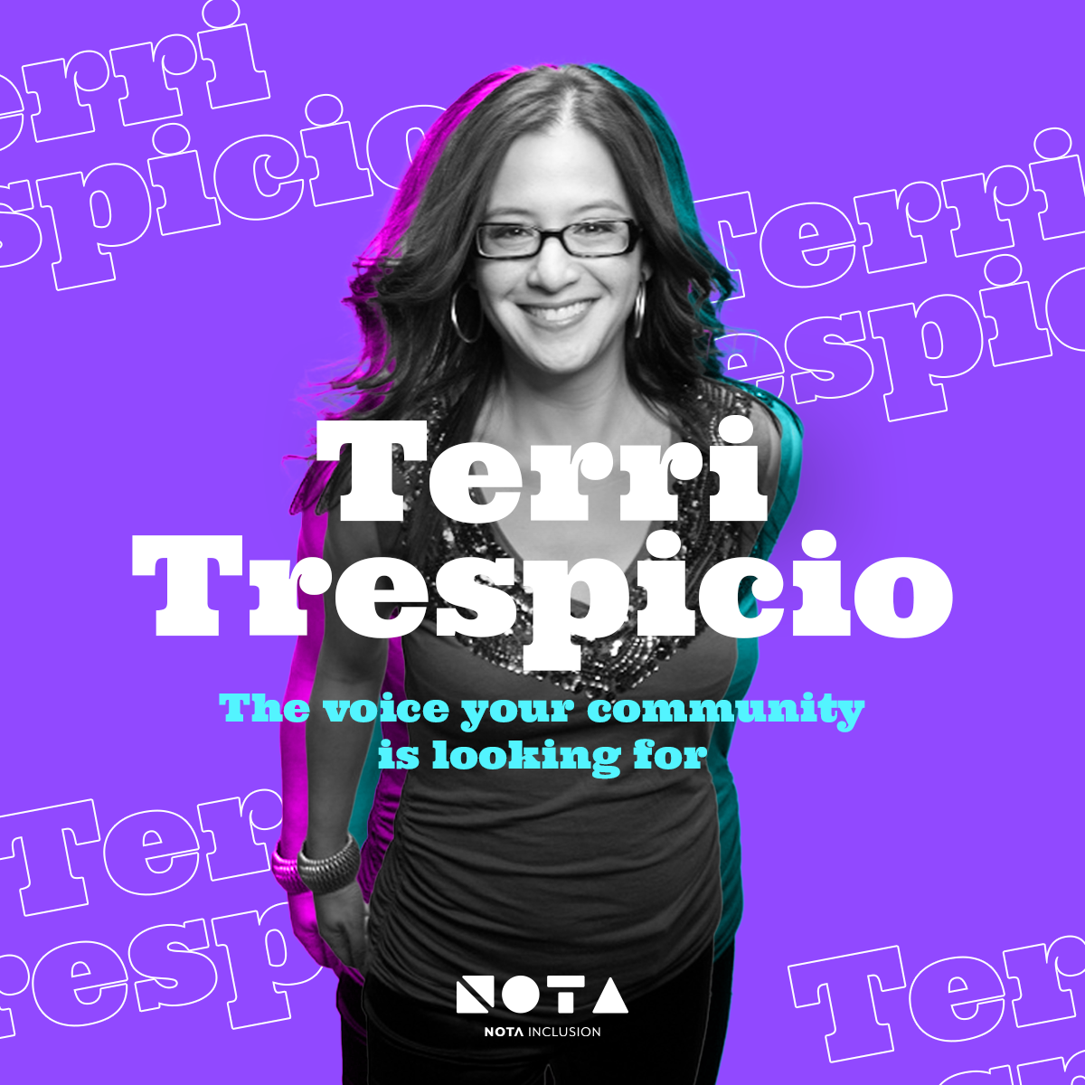
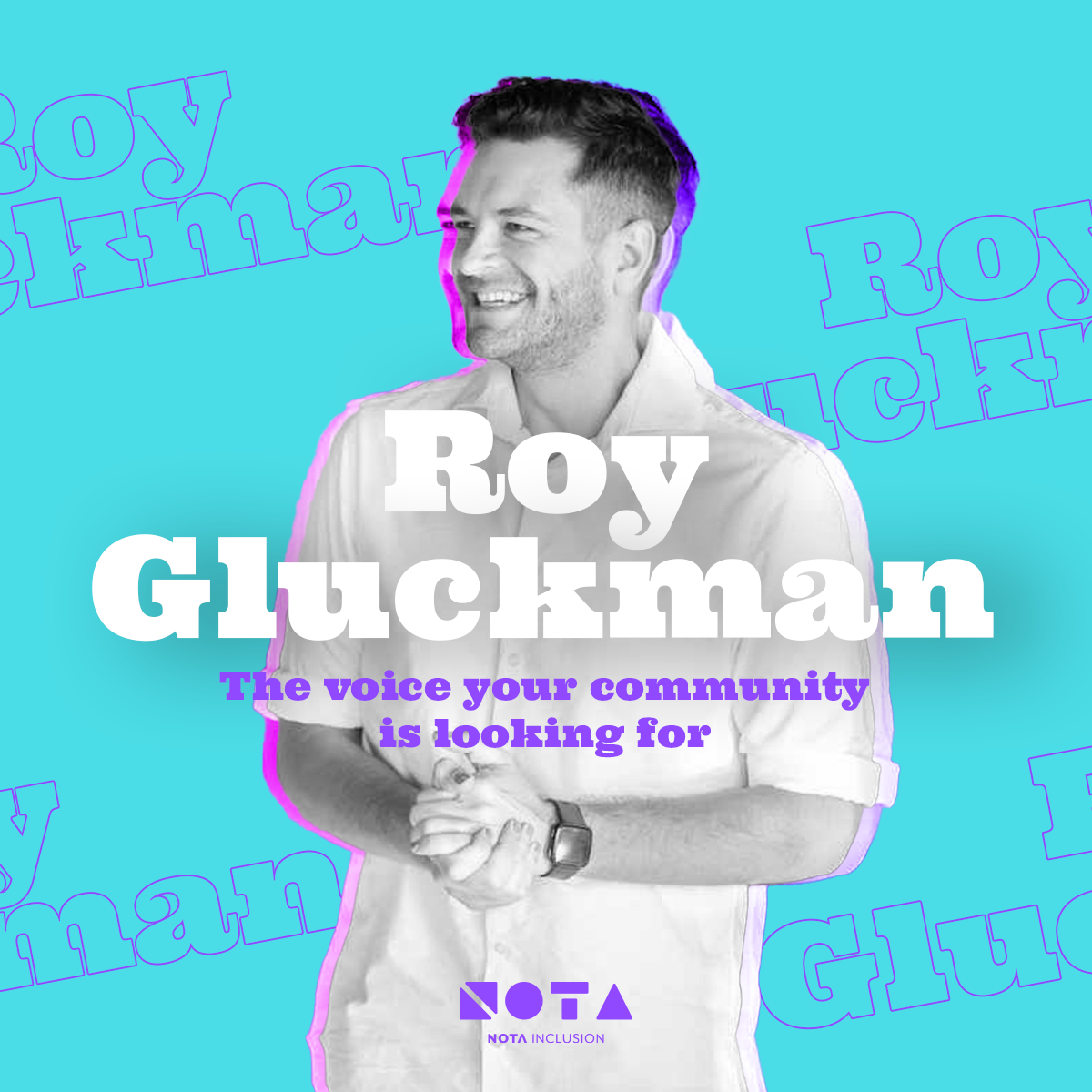
The result was not just a brand look—it was a recognizable visual attitude:
confident, modern, and purpose-driven.
confident, modern, and purpose-driven.
This creative direction helped position NOTA as a fresh, energetic and human-centered presence in the DEI landscape, differentiating the brand in an industry often dominated by corporate-neutral visuals. The system scaled seamlessly across formats—speaker announcements, surveys, campaigns, digital launches, and Eventbrite promotional materials—building a visual world that audiences could immediately associate with NOTA’s mission.